
COVID
STATUS
Yes, We Are Open
& Accepting Orders
Since Commerial Printing is considered an Essential Business, all of our locations are operating, and orders are shipping on time.
Now that the covid vaccines are available we don't anticipate any future disruptions.
TSOQ Printing, we’re taking every step possible—in accordance with government guidelines—to keep employees safe and customers satisfied as we continue with operations.

A Powerhouse of Help…
Photoshop Tutorials
Skin Tone Correction
Background Blurring
Color Cast Correction
Hollywood Eyes
Image Reflections
Printing Resources
Art Preparation
Camera Ready Art
Creating PDF Files
PDF Advantages
Typography Tips
Vector Artwork
Color Accuracy
Color Accuracy
Monitor Color
Color Spaces
Ink Colors
Printing and Paper
Printing Papers
Paper Coatings
Folding Types
Foil & Embossing
Specs & Templates
Envelope Sizes & Specs
Postcard Sizes & Postage
Paper Sizes
Templates
Glossary of Terms
Design Tips
Logo Design Tips
Direct Mail Design
Business Card Design
Catalog & Booklet Design
Flyer Design
Postcard Design
CMYK Color Space
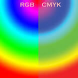
Monitor Color Display vs. Commercial Printing Ink Colors
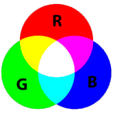
Monitor Color and the RGB Color Space
Neither your monitor, scanner nor any other device is capable of reproducing the entire spectrum of colors that are distinguishable by the human eye. Each device operates within a specific color space that can produce a certain range, or gamut, of colors.
A computer monitor (and your TV) display RGB color - the primary colors of Red, Green and Blue. The total number of colors that can be reproduce in RGB is known as the RGB color space. RGB is an additive color where light is emitted directly from an illuminant and overlaps to create colors.
The CMYK Color Space and Commercial Printing
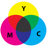
Commercial printers can not print with light, obviously, so they can not print in RGB color. All of the colors of a color photograph are simulated on a printing press by mixing four ink colors, known as process ink colors:
Cyan, Yellow, Magenta and Black.
The set of all of the possible colors that can be printed in process color is known as the CMYK color space. CMYK are subtractive colors, as colors are caused by subtracting (that is, absorbing) some wavelengths of light and reflecting the others.
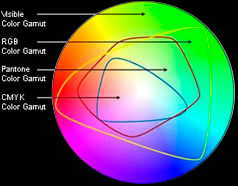
Color Gamma
The Cause of the Ink Color Limitations
Although a monitor is not capable of displaying every color in the color spectrum, it does have a very wide color space. Many colors on an computer monitor, especially very bright colors, can not be reproduced accurately on a printing press using the CMYK process color inks. This is because the CMYK color space is much smaller than the RGB color space. The RGB colors that can't be achieved are said to be“out of gamut” of the CMKY color space available in commercial printing with process color.
Color Spaces and Printing Inks
Achieving Accurate Color in Commercial Printing
All professional design programs have both RGB and CMYK color space options. If you are creating a design that will only be used for screen display, such as a website, RGB color is the proper color space to setup your document in. BUT, if the document will be printed on a printing press in process color, you want to be certain that your document in the CMYK color space.
If your document is rich with bright, vivid color, and you change the document to the CMYK color mode, you may immediately notice that you lost a lot of the vividness of color. Yes, it may not look as good on your monitor, but at least you're seeing the true representation of what you can expect on the actual print job.
Every good rule has an exception. If you are designing only for spot color output, such as a 2-color project with two Pantone Solid Colors, you could make the document in RGB color. The only reason you might want to do that is if the ink colors are way out of gamut of the CMYK color space, and you want to proof a PDF that more accurately represents the final output of the printing project.
Pantone Solid Colors
Widening your Ink Color Possibilities
Notice the round illustration above: the RGB color space (yellow line) is very large, and the CMYK color space (blue line) is quite small. The color space of Pantone Solid Colors (red line) provide a much larger number of possible ink colors to choose from.
The only problem in using the Pantone Spot Colors is expense, as they are generally only used when printing a 1 or 2-color document. When printing a full color document you are already printing in four colors. Adding one or two Pantone Solid Colors makes the project a 5 or 6-color design, driving up the cost. A common reason that solid PMS colors are added to an full-color design is for exact color-matching a corporate logo when the color shift is significantly different when converted to CMYK color.
» » Read more about Pantone Ink Colors.