
COVID
STATUS
Yes, We Are Open
& Accepting Orders
Since Commerial Printing is considered an Essential Business, all of our locations are operating, and orders are shipping on time.
Now that the covid vaccines are available we don't anticipate any future disruptions.
TSOQ Printing, we’re taking every step possible—in accordance with government guidelines—to keep employees safe and customers satisfied as we continue with operations.

A Powerhouse of Help…
Photoshop Tutorials
Skin Tone Correction
Background Blurring
Color Cast Correction
Hollywood Eyes
Image Reflections
Printing Resources
Art Preparation
Camera Ready Art
Creating PDF Files
PDF Advantages
Typography Tips
Vector Artwork
Color Accuracy
Color Accuracy
Monitor Color
Color Spaces
Ink Colors
Printing and Paper
Printing Papers
Paper Coatings
Folding Types
Foil & Embossing
Specs & Templates
Envelope Sizes & Specs
Postcard Sizes & Postage
Paper Sizes
Templates
Glossary of Terms

Design Tips
Logo Design Tips
Direct Mail Design
Business Card Design
Catalog & Booklet Design
Flyer Design
Postcard Design
Ink Colors in Commercial Printing
CMYK Colors vs. Pantone Solid Colors
The Pantone Matching System
When it comes to your company's corporate logo, it is important to know your Pantone colors to achieve consistency in the reproduction of your corporate ink color(s). Many of the industries that print inks on a substrate, from paper to plastics, ceramics or glass, all use the same color standard, the Pantone Matching System (PMS), as a method of determining and communicating color accuracy.
There are two main types of printing inks used in commercial printing, and it is important for any print buyer to know and understand the limitations and differences between the two ink color types.
- Process Ink Colors, also known as CMYK, are used in commercial printing to produce full color printing. Even though there are only four colors of ink used, they are overlapped on the printing press to create the illusion of the nearly unlimited numbers of colors your see in a photograph.
- Solid Ink Colors (also known "spot" PMS colors) are mixed to the desired color BEFORE the ink is applied to the paper (or other surface), much as paint colors are mixed before you paint a wall. Solid PMS colors are the ink types usually used in short-run “quick printing,” as well as most promotional product printing. When precise color matching is required (such as logo colors), Pantone Solid Colors may also be printed in addition to the four CMYK colors. Combining process and solid colors become 5 or more total ink colors, so price increases can be significant.
Process Ink Colors - CMYK
Process color printing (also known as 4-color printing or full color printing) is the mixing of four ink colors during the printing process to produce a nearly unlimited number of colors.
The four process color inks are: Cyan (C), Magenta (M), Yellow (Y) and Black (K - "Key").
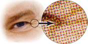
CMYK printing involves the use of halftones and screens to distribute the images, illustrations and text into a pattern of dots onto the printing plates which are then transferred to the paper. The tiny dots of each primary color are printed in a pattern so small that they are perceived as the many various color tones within the image of the artwork.
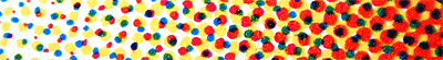
Skin tone is a mixture of Cyan, Magenta and Yellow, with little or no Black. The right side of the above image, when viewed from a distance, will appear to blend and the right side of the image will be perceived as a darker area of skin. As the dots become smaller on the left the color of the image will appear to be a lighter skin tone. Notice where the cyan (blue) and yellow dots overlap one another the color appears to be green.
Solid Ink Colors - “Spot Color”
A solid ink color, or “spot color,” is an ink color that contains one matched color of ink printed on one printing plate. Spot color(s) are often used when only one or two color printing is needed. Instead of mixing ink colors on the printing press, as is CMYK printing, spot ink colors are mixed before putting them on a printing press. Solid ink colors do have some advantages:
- Some color hues cannot be accurately achieved in CMYK printing, particularly the very bright colors.
- Since Pantone solid colors are a pure color (without mixing CMYK dots) they may appear slightly crisper.
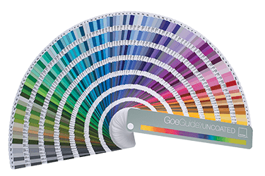
— Pantone Ink Charts —
Many manufacturing companies use PMS colors located on various Pantone Color Charts to describe and communicate hues of color, known as the Pantone Matching System (PMS). On each Pantone PMS color chip is the "recipe" to mix inks for each particular PMS ink color. The Pantone Ink Charts are available printed on both coated and uncoated paper stock, as the paper finishes cause significant color variation, not to the hues as much as their color intensity. Matte paper Pantone Color Guides are also available.
Process Color Ink Chart
The Pantone Process Color Guide
Pantone makes a Process Ink Color Chart with many combinations
of the four CMYK inks and the resulting color. On each Pantone
color chip the “recipe” of the CMYK values is written,
making the chart a valuable tool when determining
process color choices.
Solid Color Ink Chart
The Pantone Solid Color Guide
Colors created without screens or dots, such as
those found in the Pantone Formula Guide, are
referred to in the industry as spot or solid colors.
From a Palette of 14 basic colors, each of the spot
colors in the Pantone Matching System is mixed according
to its own unique ink mixing formula developed by Pantone.
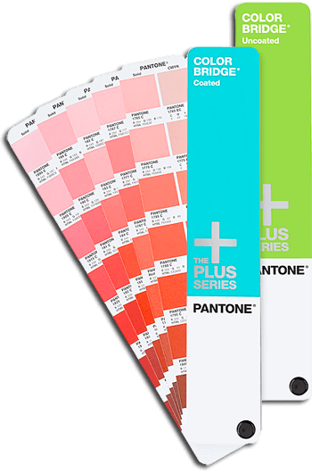
Dual Ink Chart
The Pantone Color Bridge Guide
Many solid colors of the PMS Solid Color Chart cannot be accurately
reproduced in 4-color process. This is especially true of very vivid colors,
such as bright orange and blue. Projects that must have accurate solid
Pantone color in addition to full color images require the use of
5 and 6-color printing presses or multiple press runs.
Pantone makes the Bridge Guide to show a side-by-side comparison of solid color and it's CMYK closest match. This guide is an essential visual aid tool for graphic designers to demonstrate to clients the degree to which their corporate logo colors will shift hues when printed in process color instead of their official Pantone Solid Colors.
Your computer monitor will not represent CMYK or Spot PMS colors accurately unless it has been calibrated for color accuracy. Even with a calibrated monitor, nothing beats an actual Pantone Chart for a critical color matching situation.
Printers often add coatings to finish off a printing project. Paper coatings can be used to reduce scratching and fingerprints and to add visual impact. Typical coatings include varnish, aqueous, UV and laminating. Varnish and UV can be "spot coated" for added artistic and reflective situations: to add or eliminate sheen to some areas but not others for visual impact and to control glare.
Varnish - a clear gloss or dull coating sealant.
Aqueous Coating - aqueous coating is a water-based sealant available in gloss, dull, and satin which is more durable than varnish.
UV Coating - a clear gloss or dull liquid that is cured with ultraviolet light. UV coating gives more protection and sheen than either varnish or aqueous coating. The ultra-sheen appearance of a UV coating does, however, show fingerprinting. UV on dark backgrounds makes the fingerprinting even more obvious, so an aqueous coating may be preferred in these circumstances.
Laminate - laminates protect the paper from water and are available in various thicknesses. They are costly, but provide a strong, washable surface often used on menus and books.
 Read more about paper coatings